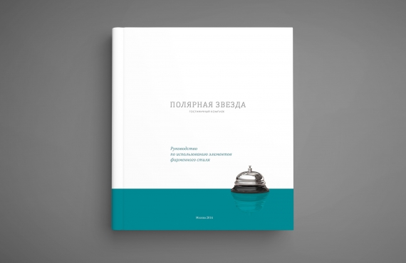
Гостиничный комплекс «Полярная Звезда»
Разработка логотипа, фирменного стиля и руководство по применению. Норильск – 2016
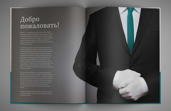
[vc_row][vc_column][vc_column_text css=”.vc_custom_1534806831374{margin-bottom: 19px !important;}”]В рамках реконструкции гостиничного комплекса «Полярная звезда», принадлежащего группе компаний «Норильский никель», перед студией была поставлена задача по разработке полного пакета элементов его фирменного стиля.
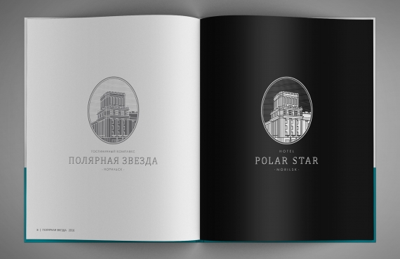
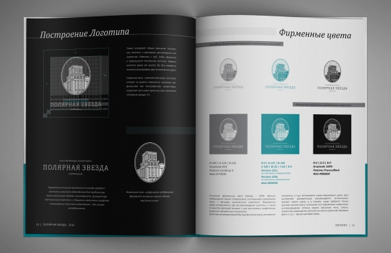
Здание гостиничного комплекса располагается в историческом центре Норильска и относится к заметным и значительным архитектурным доминантам города, являясь образцом сталинского имперского монументализма 1950-х годов. И поскольку формирование связи между архитектурой здания отеля и визуальным образом его бренда традиционно является предпочтительным – особенно в случаях, когда здание отеля является историческим и значимым для региона своего расположения, студией было принято решение использовать его в качестве основы визуального образа обновлённого бренда.[/vc_column_text][vc_single_image image=”952″ img_size=”960×285″ alignment=”center” css=”.vc_custom_1534806562673{margin-bottom: 19px !important;}”][vc_column_text css=”.vc_custom_1539804391740{margin-bottom: 46px !important;}”]Фирменный знак «Полярная звезда» представляет собой объёмный фрагмент здания гостиничного комплекса, вписанный в овал – наделяющий визуальный образ исторической устойчивостью и удачно гармонирующий с величественной стилистикой здания. Написание «Полярная звезда» и необходимые дескрипторы выполнены с помощью классических шрифтов в стиле арт-деко, сочетающих в себе характеристики исторической правдивости, надёжности и высокого статуса, но не переигрывающие при этом с излишней винтажностью – чтобы имеющий историческую стилизацию логотип был современным и соответствовал сегодняшним представлениям о гостиничной айдентике люксового сегмента. В качестве основной цветовой гаммы фирменных элементов были выбраны серый цвет в сочетании с сине-бирюзовыми оттенками – в соответствии с оригинальным и узнаваемым цветом фасада здания.
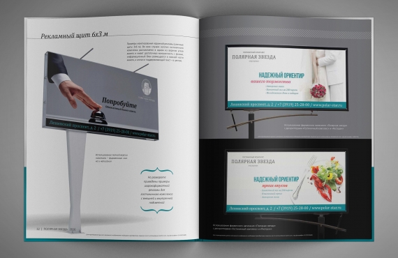
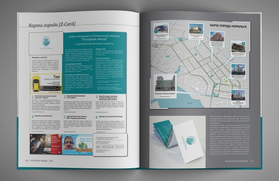
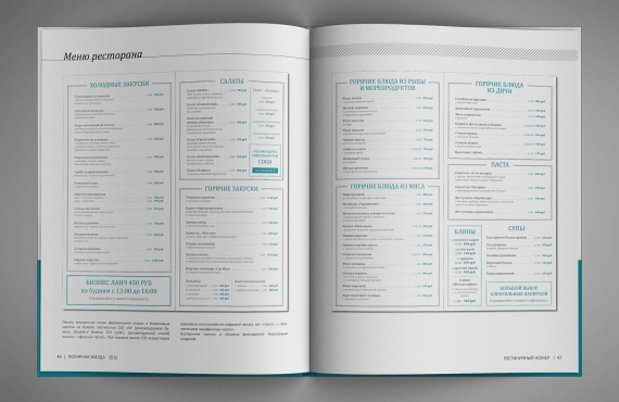
В рамках проекта студией был разработан полный пакет фирменных материалов для гостиничного комплекса: нескольких вариантов визитных карточек для управляющего состава и работников комплекса, фирменные бланки, конверты и все необходимые отелю форматы документации, а также фирменные бейджи и значки для персонала комплекса. Кроме того, студией были разработаны все форматы необходимой печатной продукции – меню ресторана, приветственные открытки для постояльцев, купоны для прачечной и т.д., и форматы рекламных материалов, включая рекламные буклеты и фирменный Z-card с картой города, макеты основных форматов печатной рекламы, тематических флайеров и концепцию наружной рекламы, ориентированной как на имиджевое продвижение комплекса в целом, так и на продвижение отдельных услуг (концепция включала в себя принципы макетирования основных форматов наружной рекламы, примеры визуальных образов и группу слоганов для продвижения отдельных направлений работы комплекса).
-
- Руководство по использованию фирменного стиля

-
- первый разворот

-
- содержание

-
- логотип

-
- построение логотипа /фирменные цвета

-

- фирменные шрифты

-

- визитные карты

-

- фирменный бланк

-

- раздел
рекламная продукция

-
- наружная реклама

-

- печатная реклама

-

- рекламный буклет
о гостинице

-
- навигационная Z карта Норильск

-

- меню ресторана
обложка

-
- меню ресторана разворот

-
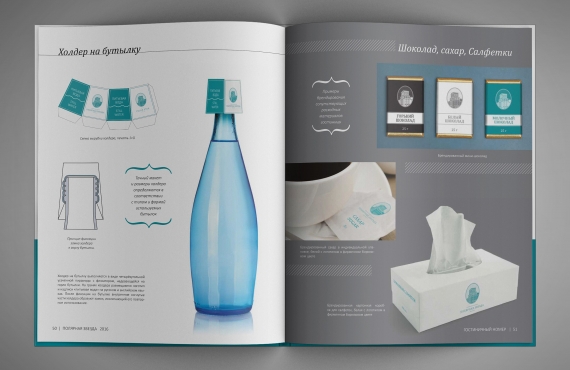
- холдер на бутылку /фирменный шоколад / сахар / салфетки

-

- cредства гигиены / банный набор

-

- клубная карта / блокнот / табличка на дверную ручку / купон для прачечной

-

- навигационные указатели

-
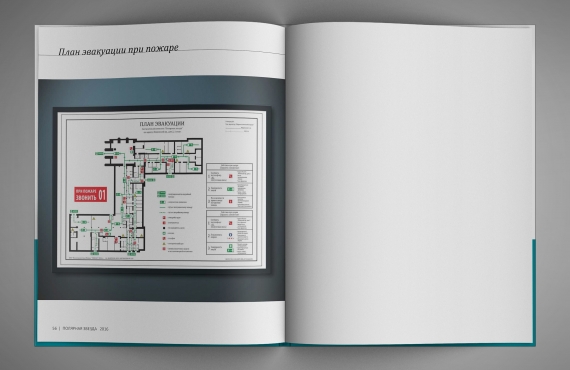
- схема эвакуации

Ещё одной объёмной частью работы над фирменным стилей гостиничного комплекса являлась разработка всей необходимой фирменной продукции, предназначенной для постояльцев отеля: студия полностью разработала дизайн электронных ключей комплекса и открыток, в которых они выдаются гостям при заселении, а также принципы брендирования средств гигиены (флаконов для шампуней и геля для душа, наборов для бритья и маникюра, шапочек для душа, расчёсок, зубных щёток и т.д.), фирменных полотенец, банных халатов, салфеток, фирменного сахара, шоколада и холдеров на бутылки для гостиничного мини-бара. Кроме того, нами были разработаны таблички «Не беспокоить» и «Просьба убрать номер» на дверную ручку гостиничного номера и клубные карты для особых категорий клиентов комплекса – выполненные из стали с гравировкой.
Также студией были детально продуманы принципы внутренней навигации гостиничного комплекса и разработан полный набор навигационных элементов – от идентификаторов гостиничных номеров до навигационных табличек, используемых по всему комплексу: разработанные элементы выполнены с помощью понятных пиктограмм и читабельных шрифтов, а также снабжены внутренней подсветкой для лучшей заметности.[/vc_column_text][/vc_column][/vc_row][vc_row][vc_column width=”1/2″][vc_column_text]Авторский состав:
Агаси Кнтехцян – руководитель проекта
Вадим Тищенко – графический дизайн
Ваагн Айвазян – графический дизайн и верстка
Филипп Труфанов – копирайтинг
Сиражудин Яхъялов – визуализации[/vc_column_text][/vc_column][vc_column width=”1/2″][vc_column_text]
Смотрите так же:
дизайн интерьера жилых номеров
[/vc_column_text][/vc_column][/vc_row]


